Showing posts with label jewellery colours. Show all posts

22.12.10

Best of Jewelry @ Unique LA Independent Design & Gift Show

all images above: earrings, necklace and ring by Sweet Siren Designs

Unique LA is an independent design and gift show. Hundreds of makers and small businesses sell to a market of 15,000 visitors over a single weekend. The premise is that all goods are locally produced, but seeing as LA is a famously sprawling city, that fortunately still leaves room for a vast amount of choice.

When I visited, the halls were buzzing with activity. I focused on two aspects: jewelry and booth design, and am presenting some of my favorites to you. Honestly, I must admit that the hour I gave myself to browse Unique LA was nowhere near enough, so this is by no means an exhaustive "Best-Of" list.

Sweet Siren Design:
Sara Yasmin produces fantasy-inspired jewelry with whimsical themes and a handcrafted touch. Her creative influences range from, "everything from Mexican and Middle Eastern cultures to mermaids, nautical, sea life, pin up girls, gorgeous flowers and old vintage costumes. There really is no end to it." Yasmin has been working out of her apartment in LA for the past 10 years. See more on her etsy site - www.sweetsirendesigns.etsy.com

necklace by Sweet Siren Design

White Fly:

White Fly designs are all cast directly from textiles into solid silver and gold. If you look closely, you can see the unmistakable ghost of real vintage lace, ribbon, satin or string. You can see the whole collection at www.whitefly.etsy.com.

silver cuff cast from lace by White Fly


iwearuwearwewear:
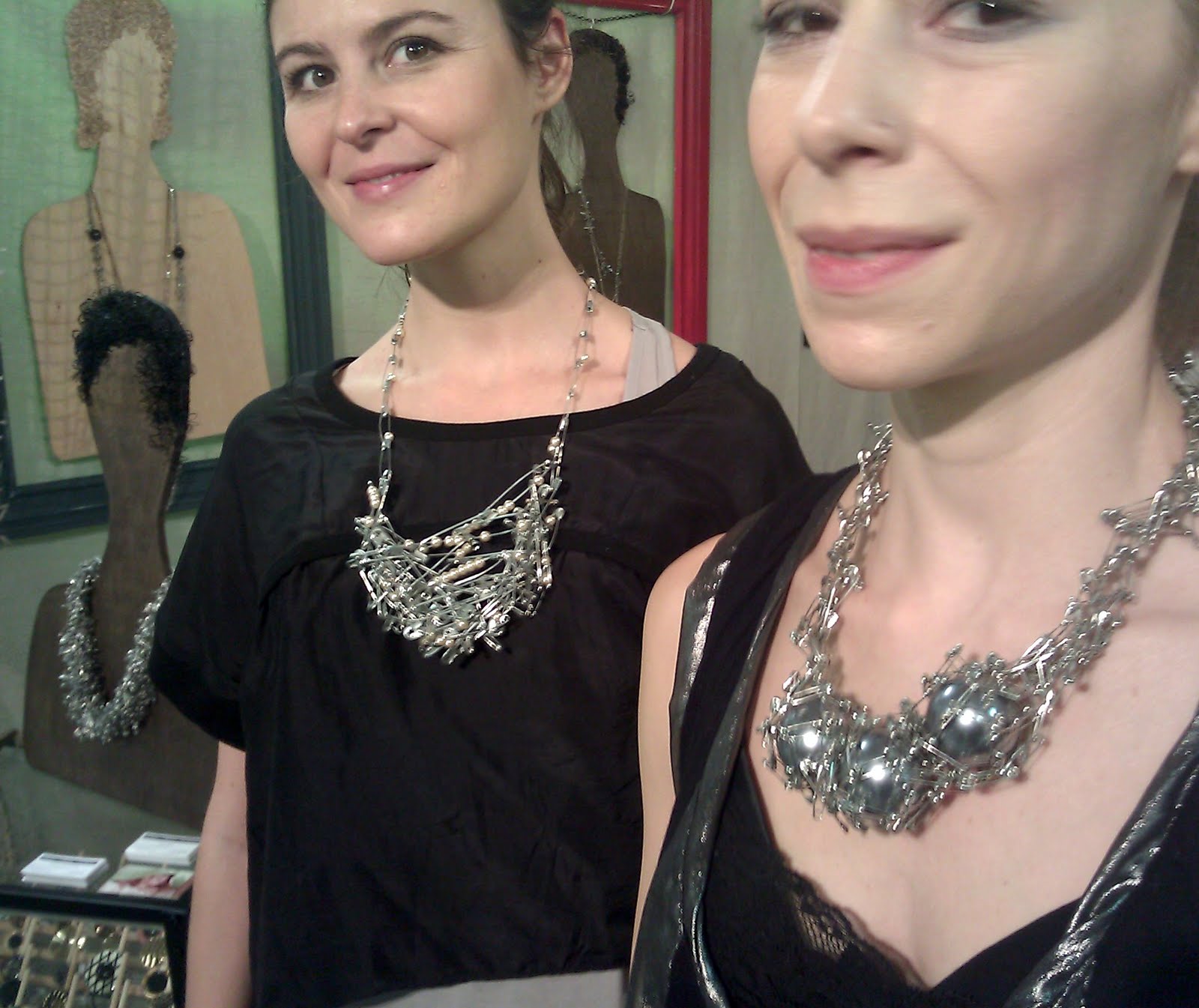
Tatiana De Andrade revisits safety-pin jewelry in her newest collection. The mix of pearls that she throws in distance the necklaces from their punk heritage, but the overall shape is still organic and rebellious. Tatiana, originally from Portugal, works out of Sherman Oaks. You can visit her online shop at
www.etsy.com/shop/iwearuwearwewear


1.12.10

Sakurako Shimizo: Sound Artifact Jewelry

"I Do" Wedding band in gold and palladium, 2008

"Sneeze Brooch" in silver, 2007

Every time we have a conversation through skype or a mobile phone, our voice travels through many digital and analogue forms. Sound get processed through countless media and comes out 'natural' at the other end, but what about all the steps in between?

Sakurako Shimizu is a traditionally trained jeweler who holds an interest in new media arts. These divided worlds collide in her "Waveform Jewelry". She mines the data of digital audio recording for the strange shapes that appear on her brooches and necklaces. To most of us looking at the jagged pieces of precious metal, we see what appears to be an abstract slash mark. A sound engineer would recognize that these 'abstract' shapes are part of a data language - they represent snippets of recorded sound.

About how she came to this fascinating idea, Shimizu says, "In Summer 2007 I was invited to participate in a group exhibition at Dorsky Curatorial in Long Island City. I decided to create a new body of work for the show. Then I wanted to try to make jewelry using the shape of sound waveform. I used a free sound editing software “Audacity” to visualize the sound.

For this exhibition, I made three brooches made with the sound of human expressions such as yawn, sneeze, and somebody said “wow”. A necklace “giggle” was made with a sound of a girl laughing. I also made a pair of earrings with a voice said “right ear” and “left ear”. A bell sound of a Church in Europe from digital sound archive was used to make a silver cuff bracelet “Bell”. A DVD player and a monitor was installed in the exhibition for the audience to enjoy both the object and the actual video of a sound wave played back.

In 2008, I extended the project to custom made wedding bands with waveform of a couple’s own voices. “I Do” project offered a unique opportunity to own a timeless representation of your partner’s voice. (Usually a couple wear a ring made with each other’s voice.)"

For more, visit http://sakurakoshimizu.blogspot.com/
or email info@sakurakoshimizu.com

26.11.10

The Digital Aesthetic of Mike & Maaike


Stolen Jewels is a project that explores "tangible vs. virtual in relation to real and perceived value." Designed by the duo Mike & Maaike, who also create products and concepts for high tech companies such as Google, this collection rips images of expensive jewels from image searches and scales them up to lifesize. The pixelated result is rendered in colored squares on leather, making for a very flattened form with jagged edges.

This quirky collection no-doubt has its appeal to the clever geeky shoppers in San Francisco, where the studio is based and sells. The pieces are certainly for those who shop with their mind rather than their eyes. Conceptually, they have much to intrigue. They make reference to our digital world, which is bold, but where is the style? To me, the style got lost somewhere between Super Mario Brothers and Microsoft Paint. I know it's not about aesthetic, but...

The aesthetic really does seem out of date. Why? It's not as if this has ever been done before. Still, it feels old. It feels kind of '90s. Probably, the sight of a pixelated image is in itself becoming outdated. In this time of ultra high-res images on computer screens and cameras, the pixelated image is dying out. When is the last time you zoomed into something so far that you got to see the pixels? It's been awhile, and my guess is that as time goes on, pixelation will start to be an artifact.

http://www.mikeandmaaike.com/#p_stolen-jewels

12.8.10

Mah Rana: Jewellery and Meaning

Mah Rana is a London-based jeweller and artist whose work is currently on show at the National Craft Gallery in Kilkenny, Ireland. The exhibition is up until October 20th, and even if you don't have an opportunity to see it in person, I recommend finding out more about her unique approach.

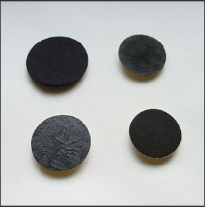
See, for example, "Out of the Dark" (above), a series she made in 2002. It is a collection of brooches, made of gold, in the simple form of a flat circle. The gold circle is painted with a black coating. This black coating is what is intriguing - if you look at the entire series, each black circle has a different texture and different tone of black. It turns out that each is blackened with a different material, which will wear away over time to reveal the bright gold layer beneath. They are pieces of jewellery that brighten with time rather than tarnish. The concept behind can be deciphered from the colour: they are mourning brooches. And they are designed to express the process of grieving, which begins as an overwhelming void that gradually gives way to new life. Black to gold; grief to celebration.

His'n'Hers, Mah Rana, 1995/2002

Rana's work as a jeweller is highly conceptual. The pieces have a very subtle aesthetic and quietly hint at a deeper narrative. Underlying it all is her developed skill in the craft of jewellery-making. She expresses her deep passion for the place of jewellery in our life through the pieces themselves, allowing the voice of the carefully selected materials to tell stories.

Image from "Meanings and Attachment", photograph by Mah Rana

In another section of the gallery, Rana has installed her interactive exhibit, "Meaning and Attachments". Here, she allows visitors to put their own jewellery on display, by being photographed and writing down the story behind the pieces. You see pride, happiness, regret, and other emotions on the faces of the visitors as they pose for Rana's camera. Visitors become models, and everyday accessories become gallery pieces. The value comes from the stories contained between the two.

Mah Rana graduated from the RCA before starting a successful commercial practice. She says, of her practice, "I really need to keep a balance between the mass production work and the one-off art works so I scaled the more commercial side down a little." For designers and craftspeople concerned with meaning, Rana is an inspiration.

Mah Rana at the Crafts Council of Ireland: http://www.ccoi.ie/news/news_item.php?listing_ID=129
Interview with Mah Rana by the Design Council: http://www.yourcreativefuture.org.uk/crafts/crafts_designer01_05.htm

3.8.10

The Smths Shop


You know, in some TV series there are sometimes "spin offs" being born from one of the character's story...

Well at Puff & Flock I am getting my own spin off, it seems : The Smths Lab, that I started this year with Matteo Oliverio, a brilliant toy designer and person. Both having a passion for playful things, we launched in Milan Design week last April showcasing our new collection of soft toys, textiles, toy-jewels, and a selection of vintage toys. This Studio works in the field of “play and learn” by designing contemporary creations and using characters as a means of empathetic communication with the user. The Smths’ projects range from industrial design to public art and academic research, and is directed to people of all ages, from children to adults who recognize in the play activity a cultural and artistic value.

After some months of hard work, we are happy to present you the Smths Shop !
Inside the online shop you will find 24 brand new products designed and produced by us + a vintage toys page for those of you who can't resist the old school flavor.


Long life to the Smths :)
Spread the word to the world !

Amelie Smth

25.1.10

The power of colours


At Puff and Flock we love to celebrate colors and what a better way to do so than with this amazing colletion of jewellery by Maria Cristina Belluci ? Simply mesmerising ...

Her work can be found at the following galleries:
Contact: mcbellucci@alice.it

Source: designboom